Brand
Brand guidelines
How to use the Localpayment logo, colors and typography, straight from our official brand book. For partners, media and anyone creating with our brand.

Logo
Our logo
The Localpayment logo represents a modern, secure and scalable financial ecosystem. Use it consistently at every touchpoint and always pick the version with the highest contrast.
Full logo, light versionFor dark backgrounds. 
Full logo, primary blue versionFor white and light backgrounds. 
Symbol, light versionThe “LP” symbol for dark backgrounds. 
Symbol, dark versionThe “LP” symbol for white and light backgrounds.
Recommended formats: EPS, AI, PDF, PSD, PNG and JPEG. PNG files are available below; ask our Marketing team for vector files.
Logo
Clear space and minimum size
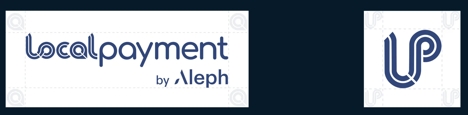
Always surround the logo with a clear space equal to X, where X is the height of the letter “o” in the logotype. No text, graphics or other elements may enter this space.
Logo
Logo on different backgrounds
Apply the logo consistently on every background so it stays clear and visible.
 Do
DoA. Dark backgroundUse the light version for maximum contrast. Ideal for presentations, dashboards and dark-mode interfaces.  Do
DoB. White backgroundUse the primary (dark) version on white or very light backgrounds. The standard for documents, websites and corporate materials.  Do
DoC. Gradient backgroundOn purple-blue gradients, keep enough contrast. Prefer the light version when the background is mostly dark.  Do
DoD. Brand blue backgroundWhen a corporate color is the background, readability comes first. Use the light version on the darker tones of the palette.  Do
DoE. Secondary brand backgroundA secondary brand color adds depth and variation. Use the light version for contrast and visibility.  Do
DoF. Light neutral backgroundOn light neutral tones, use the dark version, as on white.
Logo
Incorrect usage
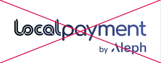
Do not alter the logo in any way. Avoid distortion, color changes, effects or placements that compromise the brand.
 Don’t
Don’tDon’t mix colors within the logo 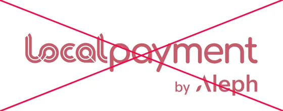 Don’t
Don’tDon’t recolor the logo  Don’t
Don’tDon’t use low-contrast tints  Don’t
Don’tDon’t fade the logo or add transparency  Don’t
Don’tDon’t use colors outside the palette  Don’t
Don’tDon’t place it on low-contrast backgrounds  Don’t
Don’tDon’t apply gradients to the logo 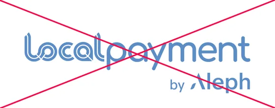 Don’t
Don’tDon’t swap the brand blue for another shade 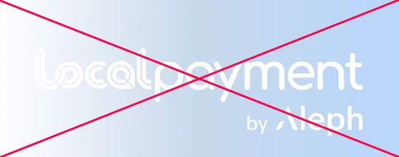 Don’t
Don’tDon’t use the white logo on light backgrounds
Color
Color palette
The palette reflects Localpayment’s identity: trust, innovation and technology.
Primary colors
The core of the identity: navy and primary blue lead every layout.
- Navy
- HEX
- #0C1A29
- RGB
- 12, 26, 41
- Primary blue
- HEX
- #31467C
- RGB
- 49, 70, 124
Secondary colors
They support the primary colors and add depth and variation.
- Indigo blue
- HEX
- #4557A7
- RGB
- 69, 87, 167
- White
- HEX
- #FFFFFF
- RGB
- 255, 255, 255
- Sky blue
- HEX
- #5B8DC5
- RGB
- 91, 141, 197
- Steel blue
- HEX
- #4D77A9
- RGB
- 77, 119, 169
- Denim blue
- HEX
- #486FA2
- RGB
- 72, 111, 162
Neutral colors
For text, backgrounds and quiet surfaces.
- Black
- HEX
- #000000
- RGB
- 0, 0, 0
- Light grey
- HEX
- #D9DEE1
- RGB
- 217, 222, 225
- Ice blue
- HEX
- #B8D6FA
- RGB
- 184, 214, 250
RGB values are calculated from the HEX codes. For print references (CMYK), ask our Marketing team.
Typography
Typography
Two open-source typefaces: Manrope leads, Overpass supports.
Primary typeface
Manrope
Manrope is used for headlines and key messaging. It gives a clean, modern and professional look.
Payments infrastructure for Latin America
- Manrope Light300
- Manrope Regular400
- Manrope Medium500
- Manrope Bold700
Secondary typeface
Overpass
Overpass is used for supporting text and digital environments. It complements Manrope while keeping text readable.
Payments infrastructure for Latin America
- Overpass Regular400
- Overpass Bold700
Brand questions
Can I use the logo without asking?
For editorial use, such as articles or event listings, yes, as long as you follow the rules on this page. Co-branding and partner materials need written approval.
Which colors should I use?
Navy #0C1A29 and primary blue #31467C are the primary colors; the secondary and neutral colors support them.
Which typefaces do you use?
Manrope for headlines and key messages, and Overpass for supporting text and digital environments. Both are open-source typefaces, so partners can match our materials without a license.
How do I write the company name?
Localpayment, one word with a capital L. When relevant, “Localpayment, part of Aleph Group”. The logo lockup reads “Localpayment by Aleph”.
Questions about the brand?
For vector files, co-branding approvals or anything not covered here, write to our Marketing team.